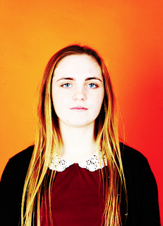
 |
| Original Shutter speed:1/125 F Stop:9.0 |
 |
| Shutter speed: 1/125 F Stop: 8.0 |
 |
| Edited |
portraiture. WE done this by originally looking at a selection of photographers, shown on my image ban and my "research homework" blog. We then started experimenting in the studio of different portraits. I wanted to add these two here in as examples of my work because I believe it shows my learning very well. The one with the orange background is a head and shoulders photo, an example of Thomas Ruff's work. Whereas the one with the white background is an example of Alec Soth's work, except it doesn't have an image surrounding her. This is something I would like to further do, hopefully in next lesson, take images of portraiture, but with them outside so they have surroundings and can tell a story from the picture.
A photo from today's lesson that I do like...

I really like this image- the edited is on the left and the original is on the right. I believe this image is a good example of a dead pan look, an example of Thomas Ruff's work. I also like how this is a box standard portrait, yet is very intriguing. For me, when it came to editing, I wanted to make sure the eyes were almost piercing- to draw in focus. The eyes would be on the top line of the rule of thirds, where I would hope people to look first. The reason for this is because rather than this being an everyday portrait, I wanted expression from the dead pan to pierce into my audience. The camera setting I used for these images was, shutter speed: 1/125 and the F stop 8.0. When I used the orange background- I took "passport" looking images, so my F-stop would have had to be lower for the exposure of light in my image. If I had a higher F-stop, as it was closer up, the exposure would have been too low and would be darker. I also had the shutter speed as 1/125 because I needed a fast shutter speed to ensure my photo wasn't blurred.
A photo from today's lesson that I don't like...
I don't particularly like this image because as the photographer, I should have told her to put her hands by her side as I believe this looks rather untidy. Also I don't like how she is leaning towards the center as I would have preferred her to be stood straight on the right third. Like the above image the shutter speed was 1/125 again so ensure there wasn't any blur around my subject. However, for this photo, I had my F-stop at 9.0 because my subject was further away and I had more in my frame, if the F-stop was at 8.0 it would have been a bit lighter than my final shot.
Progression...
I believe portraiture images would look better if my lens was able to zoom in/ focus whilst being closer, after getting an extreme close up I would have edited it much better- if I knew how to. I would also like to make it much more interesting rather than box standard photos- so the background wasn't a plain colour but was a landscape. If I were to re-do this shoot I would keep in mind different ideas of editing to try and shape my photography around my inspiration.


a good post I like the way you have added retouched and non retouched images, also the location portraits are on point... YOU MUST NOW USE THE CAMERA SETTINGS TO HELP EXPLAIN THE VISUAL OUTCOMES ATTAINED.
ReplyDeletePlease retouch the top LHS image by cropping and also dodge around the finger to make it lighter..
ReplyDelete