Tuesday 15 December 2015

Documentary Photography

Photo Documentary: This is the usually the popular form of photography and is used to record both significant and relevant historical events and everyday life. It is also know as "real life" photography and "reportage".

The decisive moment... This refers to capturing an event that is spontaneous, where the image represents the essence of the event itself. Henri Cartier-Bresson's work uses the decisive moment. These images are when if the given photo was taken a fraction of the time later, the main subject/ point of the image would either not be there or the photo would be different- missing a section.


 Henri Cartier-Bressons work...
As you can see from the following images, Henri Cartier-Bresson's work consist of a variety of different documentary frames, where if each one was taken a moment later, the subject would either be gone, or in a completely different position, this shows how photos are one point in time that would never be able to be replaced/ repeated.

Cartier-Bresson was born in 1908 and died in 2004. "For me the camera is a sketch book, an instrument  of intuition and spontaneity."- quoted by Henri Cartier-Bressons himself. This conveys how his approach to photography was a very arty and open minded one- because each photo taken is significant it is own way, not 2 photos would be the same, it would always either be in a different angle, position of the subject would have changed some how, perhaps moved their hair, changed their clothes or just walked away. From researching his work, I believe his work has captured this idea very well. His work also shows a variety of different elements combined into one photo.
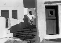
For example, This photo shows both depth- through the stairs and the subject being further away, also shadowing helps create this idea. Yet it also shows lines/ leading lines- towards the subject. If this photo was taken a moment later, the subject would be gone, if it was taken a moment earlier, her back would be to us, we would not see how she is presented to be running . As documentary photos are telling a story, I believe black and white is a key to helping this come across. Although in this image it looks as if most of the content is either black or white- depending of the colour outfit the subject is wearing. Although it could have been if it was a bright/ bold colour, Bresson could have made everything black and white but the clothes. However, this would really help the documentary side of the photo, but it may make it more engaging.

The use of reflection works really well here, along with the rule of thirds show how the subject is at (what I would call) a good part of the frame- if it were earlier I believe he would have been too centered and if it was taken later he would be gone. I like this image as you can tell he is in a rush to get somewhere, yet it almost seems he's "running on water". Although the story of this image is unclear, this image is a really impressive way to convey the "decisive moment".
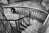


Again, continuing from the two images above, this photo shows the decisive moment. As you can tell Bresson's work consists a lot around the decisive moment. In this image, the person on the bike is positioned in the best part of the frame- the only gap he should be in- other wide he would either be blocked by the railing or only half of him would be seen.

Sally Mann
Sally Mann was born in Lexington Virginia 1951 and is one of America's most renowned photographers. She has been awarded with several NEA, NEH and her work is held by major institutions around the world. Mann's work is displayed with in books and films. Examples of her books are "proud flesh" and  "Immediate Family", her photos are "worth a thousand words" each one telling a story themselves. 

 This image suggests it was taken in the depression times as the woman is with the word "doom". The way it is written on the car implies this dusty old car is much like all the others and people are trying to plea for help as much as they can. The dust on this car could be from ash of a bomb. Being able to take this judgement from this image just supports how this photo can tell a story- just the way a documentary photo should.


 This was one of my favorites when exploring Sally Mann's work in terms of photo documentary because I believe the way it captures a decisive moment is very important. Even though you can't see the faces of the children, you can tell the deep concentration and focus of the destruction happening behind them. By the looks of it, these children were having a picnic and something perhaps a building caught fire. The use of the vignette is very key here because it gives this a "oldish" effect- helped by the black and white aspect shown in all of these images.
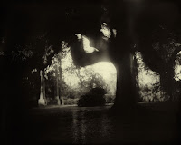


This is another one of Mann's work in which I find really interesting and like because its an "eary" creepy looking landscape image. Landscapes are one of my favorite photos and believe this one can tell a very good story. Just looking at it you can tell it's not a happy place, perhaps by a graveyard or deep into a forest where no one dares to go as it all looks the same. This photo looks as if it was taken in the summer time as the trees look full and you can see a bright section at the back of the image, if it wasn't black and white, this photo may not have the same effect giving off a horror genre, it may look like a tree in a park, as the deep greens could show happiness instead.

Comparison:
As shown above, Bressons work focuses on the decisive moment of photo documentary, yet in contrast Mann's work focuses on telling a story with her work. In both sets of images, the black and white theme is used, when researching I found that their work is all done is black and white. With Bresson's work, I am not too sure whether the black and white theme was used because they were taken long ago, but with Mann's work, it is quite recent so the black and white theme would have been deliberate. The way both photographers use a variety of different formal element makes their work intriguing because the longer you look at their work, the more elements you can pick out, even though the elements are much more subtle in Mann's work, they are still there.

Thursday 10 December 2015

Portraiture retouching

retouch skin.
image mode, CMYK colour, (in the channels not layer)  select yellow layer, cmd A, cmd c, go back into layer, cmd alt Z (step back) cmd v,  re name flaws, cmd I (inver), (blend mode) soft light, opacity, add layer mask (invert mask) alt add layer mask, make sure background is white, select brush, make it big, 50% opacity, paint the skin,


Cloning out wrinkles and blemishes
cmd j, re name-wrinkles and blemishes, spot healing brush, alt and drag, go over any imperfections, reduce opacity, fill colour mask with grey

The original


The edited...
This image is after retouching the skin and the cloning out wrinkles and blemishes (it will show more of a difference if you click the image to enlarge it) I first touched the skin making it a tiny bit darker, giving her more of a tone- and smoothing out the skin. I think blended her skin- smoothing out the blemishes on her face and forehead. I also saw deep creases around the eyes so I removed these as well. I really like this edited picture because her skin looks much clearer. I did attempt to blemish out her freckles although this made the subject look very fake and I did not like this. The way I blemished her skin was by using the "healing brush tool" as shown in the screen shot above. I then pressed alt and clicked part of her skin, when I done this, a little finding came up and then I dragged the pointed on the part of her face I wanted to blemish out. This was a really easy way to removed any unnecessary blemishes. To removed the wrinkles around her eyes, I used the patch tool shown at the bottom of the screen shot above, then roughly drew around the wrinkles. as shown in the screen shot on the left. Then I moved the selected part on the clear part of the face and then it replaced the wrinkle. I really like this effect and believe it makes it much better as it looks much clearer.


The retouching of the skin…

First you click on image, then mode then CMYK colour.

Then whilst in channels, you can see a verity of different layers. You want to click on the  yellow bar, making the image look like the one show on the left.
You then want to click CMD A, this will select the whole picture.
To copy it you want to click CMD C
Then when back on the layer side, click ALT CMD and Z, this will undo the changes (do so until the image is back to the normal state.)
When at this stage click CMD V which will paste a separate layer and look like the way it did before.
To make it easier, this layer should be renamed FLAWS, so you know where this layer is later on.
You then need to click CMD I which will invert the picture.


To change the invert, you need to click on the bar that originally says normal, you need to change this to soft light. If you wish, this is the stage you can change the opacity if necessary.


By clicking ALT you want to click the "add layer mask" tool. This should make you layer section look like this (shown above).


As the background here is shown as black, you need to make sure you paint brush is in the colour white because otherwise it will not make a difference to your image.

The final step is to just move your brush across the face, the parts that you want to retouch!

Portraiture Low key lighting work diary, Tuesday 8th December 2015

Shutter speed: 1/125
F-stop: 16
ISO: 200
Shutter speed: 1/125
F-stop:16
ISO: 200 
 During today's lesson, I was able to further my exploration into portraiture, however unlike my other lessons, I was able to control the lighting- something I've been wanted to lean. I really enjoyed learning about controlling the light in this way because I believe it creates a really well final result- doesn't even need to be edited too much. My set up is shown below. However, I didn't keep my light in the same place when taking my photos. I experimented in different ways, such as making the light close up to the face. High above the head, or low. I also varied how much exposure there was on the white reflector wall because this meant the other side of the face was too dark.

My studio set up...
As you can see, I had a simple white background and a white reflector wall on the left side of my subjects. The way this is placed is very important because if it was too far away, it wouldn't have made a difference, however as it was close, it made my images much better- by making the shadowed side of the face lighter- yet not as light as the high lighted part, so there isn't much distraction. Also you can see how my subject was placed in the middle of the light and the reflector wall. This photo of my set up shows the closest my light was to the subject. However as mentioned above, I did vary my light placement. I believe this is the main thing in this type of set up that you can manipulate, other than the subject of course as you won't want the same position throughout your images.


A photo I like from this shoot...
This is one of my favorite images that I shot today. This is because when researching Low key lighting on portraiture, I came across images where the highlighted section wasn't on the face, yet was on the hair. I really liked this idea and believe this image is a good way of showing this. The main concept of portraiture is to show expression, I believe that this is still conveyed in this photo even if the highlighted section isn't on the face. The camera settings on this image was the shutter speed was 1/125, the F-stop was 16 and the ISO was 200, these camera settings made the background as dark as this and it also meant the focus was on the light. I also like how the features on her face are very clear, such as the eye lashes, showing a very feminine touch to this photo.


A photo I don't like from this shoot...

I don't really light this photo because my subject was mid laughing and as she ducked down from the light, there is a clear division of lighting- going from clear highlight to clear shadow. If she was sat up, it would have varied much better. Although as this is the final image, I don't really like it very much. I also don't like how the lighting is clearly on some of the background because it is lit up more than I had anticipated- unlike the image above.


Progression...
If I were to re-shoot this task, I would like to have made only small sections on a face or body light up, whilst the rest was in darkness. I would also like to experiment with different camera settings- to see which is the best way to capture the images in the way I wish to. Examples of this progression are shown below...


Tuesday 8 December 2015

Portraiture Low key lighting Straight images

Shutter speed:1/125
F-stop: 16
ISO: 200
Shutter speed: 1/125
F-stop: 16
ISO: 200
Shutter speed: 1/125
F-stop: 16
ISO: 200
Shutter speed: 1/125
F-stop: 16
ISO: 200
Shutter: 1/125
F-stop: 16
ISO: 200
Within this lesson, my photos were all the same camera settings. Even though I should have experimented with a variety of different setting, I really liked the outcomes of these images. I picked these ones as my top 5 because I really like how even if I edited them in black and white or left it in colour, the highlighted part compared to the shadowed part is so dominate. I also like the way that even though my background was white, due to the fact I aimed the light at my subjects instead of the background, there was no reflecting off it, creating a much darker background.

Portraiture Low key lighting contact sheet


Portraiture Low key Lighting Image bank

When researching Low key lighting, I came across this image which I really liked because I believe it shows how low key lighting can be used to create a spot light on the chosen subject. In my opinion, this use of lighting is good for photo shoots on fashion magazines because it is a good way to represent feminine features. Hopefully, if given the chance, I would like to create this image. Although a problem I may encounter on this is that I may not be able to have a snoot on my light. 
I also like this image and find it inspiring because I like how she isn't looking at the camera and has her hand as part of the image- the lighting here is clearly opposite her because you can see the highlighted sections are in a wide part of her face, yet the sides are much darker. I would like the create this image, although, I may not be able to do it this time- but another time, because there will be groups of us on each part of the studio, so I won't be able to move the equipment around too much. However, I do intend to capture an image like this later on.
I normally wouldn't like a rebellious looking image such as this one, however in the case of low key lighting, I actually find this a rather inspiring photo because the hood is creating a shadow around the face- making the mid section, around his nose much brighter. I would like to create an image like this, although I believe it would only work with a male subject because the angry glare of the eyes and stern facial expression would work much better if it came from a man. 
Much like the image above, this is a sort of rebellious image, just in a different way. I find this image inspiring, however I wouldn't like my subject to be smoking because I do not think that makes an image any better. Excluding the cigarette, I would like the create this image because I believe the lighting really helps create masculine features on his face. I also like how he is facing head on because it makes the change in lighting very clear across the face. 
I really like this image because I believe the female glance is very clearly shown here. I also like how the lighting conveys her cheek bones very well. Not only this but the editing works really well in this image because the majority of the images that I found whilst researching were in black and white, or the ones in colour didn't look as good as they could have. Although I believe this image works really well. 
This is another example of how lighting can be used to show the masculine aspect because you can see his jaw line very clearly, alongside the frown of the eyebrows, and the shoulders are seen to have muscle on. I also like how only one side of his face is clearly visible in comparison to the other half.

Irving Penn Research.


Irving Penn... 
Was born in 1917 and sadly passed in 2009. He was most famous for this fashion photography and his portraits. Examples of his work are shown above. Penn's work is a really good example of low key lighting, and high key lighting. As you can see, his work was to capture the clear facial features of the women- for his work at vogue. Alongside showing the masculine features but making it much darker. as you can see from the top middle image, most of the image isn't seen, yet the facial features (the most important part on a portrait) are highlighted.
Penn was one of the first photographers to present their subjects on a grey background. As his career expanded, he continued to expand his studio set up, constructing different sets of backdrops and angles. 
As shown from his work above, you can also tell how depending of the gender, he experimented with the lighting as well. It is most likely that his photos of women- especially the ones above, were for fashion magazines/ vogue.
It is no doubt that Penn paid attention to the small details when capturing his photos- that would have been helped by the use of studio lighting.

Portraiture Lighting definitions

Irving Penn
Low key lighting


What is a portrait?
Portraits convey emotions an insight to a persons mood, identity
choice of lighting
control of lighting

Hey key lighting an image with predominantly light tones: used in beauty images, light hearted, fun
Low key lighting an image with predominantly dark tones: creates mood, show strength and muscular.

In photography, a snoot is a tube that fits over the studio lights so the photographer can control the direction and the radius on the beam on the subject. The image on the left is an example of what a snoot looks like. The example shown on the right shows how a snoot can be used to make an intense spotlight on the subject, making the surrounding area dark.


A Honeycomb is place on the lights in a studio, so lighting can shine through is part of the honeycomb shape creating tight beams of light onto the given subject, however it isn't as intense as the snoot shown above.


Reflector dishes in photography are used to help direct the lighting to the subject. It also makes it easier to control the lighting. The example of the reflector dish in use shows how unlike the snoot, reflector dishes make a wider range of lighting on the subject.


Low key lighting…
This is when the photographer controls the lighting yet only the part of the subject is visible- creating a mysterious idea of the subject. It can also be used to show muscular parts of a male face- a jaw line, and with women it can be used to hep show cheek bones.
 These 4 images are examples of low key lighting. I like the deep emotions joined with these images. with the top 2 images you can tell the lighting is on the side of the person as their further side is lit up. Whereas the bottom left image there was be tightly control lights on either side on the face, making the face unseen but the hair is. Then on the bottom right hand images, you can see how lighting is used to show the muscular part of him- his jaw and sharp facial features.