- before and after shots
-Evaluation
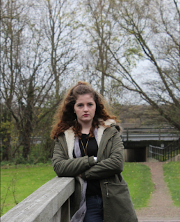
Original image…

Curves...
The use of curves here shows a much stronger contrast than the original image. I like to use the curves tool instead of the "Brightness/contrast" tool because it is much more precise.
Burn and dodge…

This is a more extreme version of dodge and burn tool. I would use this to make perhaps a shadow more lighter or a highlight more darker. The left hand image shows the way I made it feather around the actual image- to make it more realistic (even though this is an extreme example).
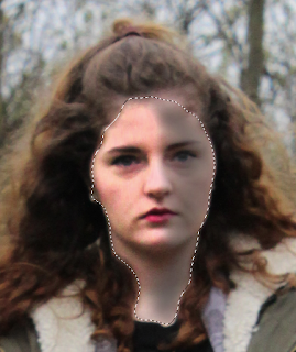
Hue and saturation…
Hue and Saturation is a good way to change all the colour levels, saturation and lightness. As you can see from the screen shot I made the saturation high and shifted the hue level, I also had a selection around the face which made it more pinker. I don't really like this tool on portraits although if I were to make it black and white I can just lower saturation, it was also be a good tool for nature images- flowers for example as you would be able to change the colour. On portraits it doesn't work too well as it changes the face colour.
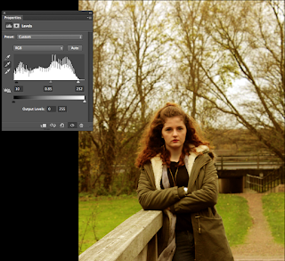
Levels and white balance...
 This was just a simple change of levels as I moved the pointer when the level of light was at a bare minimum because this gave it much more detail compared to if the 3 pointers were all shifter to the left side for example. I also used the middle selector tool to change the colour slightly. I done this by clicking on the sky- this is meant the white balance it although as it is the sky, it didn't work exactly, it gave it an almost sepia tone instead.
Vignette...
Original...


This is a very faint vignette that I wanted to use. I done this by first going onto curves and clicking the gradient tool making sure the density isn't too high or low, and dragged the mouse down from the centre and it made the outer photo darker than the original. This is edited although just from this tool. I quite like this as it seems to have been more tools but it isn't and the contrast seems high- even though it's just a vignette.
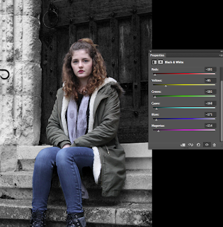
Selective colour.
 For this image, I made the background black and white and kept my subject in colour. I like this effect as you can use it when wanting to put focus/empathises of the subject. When this example I slid most of the bars to the lowest- to make that colour the darkest because the background was already darker tones anyway, I just wanted to make this more dominate.


No comments:
Post a Comment