


My work has overall been influenced by many different photographers I have found through my photographer research. An example of this is the work done by Rut Blees Luxemburg. Her work helped influence my landscape work. For example, this encouraged me to go to London and try to capture building at night. I did actually really enjoy my shoot of this. An example of her work is displayed above on the right and an example of how her work has inspired my work in displayed on the left above and the middle. Furthermore, another photographer who's work really inspired me and I liked their work, was Ansel Adams. This was because he use of burning a frame around the images and the use of black and white, inspired me to take photos of landscapes and edit them in this form. An example of Adams work is shown below on the left and my example is shown below on the right. Obviously being in Harlow I was unable to take photos of mountains and rivers of this sense.


 |
| 1. |
 |
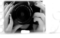
| 2. |
Personally, I would say my photography has massively improved within this unit. Above displays two photos. 1. One of my first photos I have taken then 2. one of my more recent ones.
1. When taking this image, I had been given this camera which I had never used before to got out into town and take photos of lines. My thoughts were literally looking for objects which are lines, seeing a drain on the floor and then took a photo of it. It didn't really take any thought to do it. There is shadowing casting over halfway of the image, it is also very wonky.
2. This is a more recent image which I took in London by Buckingham Palace. This was to show depth. I am very proud of this image as a whole because I think it has worked very well. It also shows my progression with my camera setting techniques compared to the first image. To me the colouring of photo 1 is very bland and dull compared to the bright colour dooming out of the second image.


Ways in which I have demonstrated experimentation include editing my images through selective colouring. The first image above shows this. I have learnt that through the quick selection tool, you can select the surrounding of what you want black and white, then change it black and white, giving this effect. Another computer experiment which I have learnt is just using black and white as a whole as displayed in image 2. Another example which I have included in this evaluation showing my demonstration of experimenting, is the 3rd image, this included something I found when looking at documentary photos over christmas- it is an effect called a Bokeh effect.
As I was told what I had to take photos of- set elements, I do not believe it gave me a direction for my creativity to go. I weren't able to display myself as much as I could. Therefore I think as this moment in time, my work isn't going in a given direction. Perhaps next component, my work will aspire more to my creativity.
 |
| Documentary photography |
 |
| Element-form |


