Saturday, 28 November 2015

Portraiture Landscape Thursday 26th November work diary.

Shutter speed: 1/125
F-stop: 9.0

Shutter speed: 1/125
F-stop: 9.0

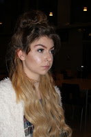
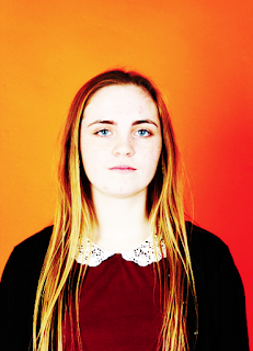
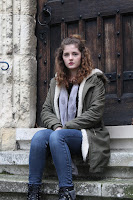
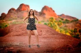
 Due to being ill, I missed the lesson on Tuesday 26th November, so when someone was round, I went out around town to take photos of her. I really enjoyed this because I was given the chance to put my portraiture knowledge from last lesson including landscapes in the background. When taking photos, I found myself using a lot of Alec Soth's work- including the whole body and landscape surround- to tell a story (as shown on the top left hand image on this blog). However I also used Thomas Ruff's work, just instead of a plain background, I had a landscape/ objects instead (as shown on the top right hand image on this blog).

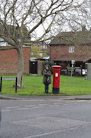
A photo I like from this shoot...
I really like this image because it's a simple dead pan but shows not only the background, but the whole body. I tried as much as possible to center her head on the top line of third. I also like the simplicity of this image, I didn't want her to sit on the very top step because otherwise she would have looked too close to the door, which I didn't want. The shutter speed I used here was 1/125 and the F-stop was 9.0. Most of my images from this photo shoot had the same camera settings, I should have had a wider range although I did change the ISO. 


A photo I don't like from this shoot...
I don't like this image because she is mid through speaking so her mouth is open- I would have rather this of been a dead pan. Another reason I don't like this photo is due to me missing the lesson, I didn't want all my shoot to be of the person shown above, so after college I done a shoot with a couple of other people, but this was at 4:00 so it was quite dark, this meant to get the best lighting I had to use the flash but this artificial way of lighting creates shadowing which I really would like to avoid when taking portraiture. The shutter speed here was 1/125 and the F-stop was 8.0.   


Progression...
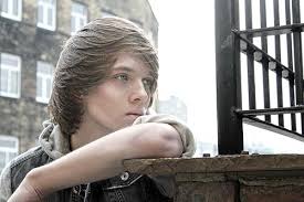
If I were to re-do this task again, I would definitely make sure that all my images were taken during the day so I don't need to use the flash because not only does this wash out the subject, it also removes the landscape/ objects behind it. I would also vary my camera settings a lot more to get a variety of different images. I would also like to position my subject further away from an object (for example position them away from the wall) so I can manually focus my image, making the background out of focus and my subject in focus. Examples of way I would like to progress my work are shown below...



Portraiture Landscape Straight images


Shutter speed: 1/125
F-stop: 9.0


Shutter speed 1/125
F-stop: 9.0

Portraiture Landscape Contact sheet


Wednesday, 25 November 2015

Portraiture Tuesday 24th November 2015

Original
Shutter speed:1/125
 F Stop:9.0
Shutter speed: 1/125
F Stop: 8.0
Edited
During the lesson on Tuesday 24th November 2015, we began discovering ways to create
portraiture. WE done this by originally looking at a selection of photographers, shown on my image ban and my "research homework" blog. We then started experimenting in the studio of different portraits. I wanted to add these two here in as examples of my work because I believe it shows my learning very well. The one with the orange background is a head and shoulders photo, an example of Thomas Ruff's work. Whereas the one with the white background is an example of Alec Soth's work, except it doesn't have an image surrounding her. This is something I would like to further do, hopefully in next lesson, take images of portraiture, but with them outside so they have surroundings and can tell a story from the picture.

A photo from today's lesson that I do like...

I really like this image- the edited is on the left and the original is on the right. I believe this image is a good example of a dead pan look, an example of Thomas Ruff's work. I also like how this is a box standard portrait, yet is very intriguing. For me, when it came to editing, I wanted to make sure the eyes were almost piercing- to draw in focus. The eyes would be on the top line of the rule of thirds, where I would hope people to look first. The reason for this is because rather than this being an everyday portrait, I wanted expression from the dead pan to pierce into my audience. The camera setting I used for these images was, shutter speed: 1/125 and the F stop 8.0. When I used the orange background- I took "passport" looking images, so my F-stop would have had to be lower for the exposure of light in my image. If I had a higher F-stop, as it was closer up, the exposure would have been too low and would be darker. I also had the shutter speed as 1/125 because I needed a fast shutter speed to ensure my photo wasn't blurred.

A photo from today's lesson that I don't like...
I don't particularly like this image because as the photographer, I should have told her to put her hands by her side as I believe this looks rather untidy. Also I don't like how she is leaning towards the center as I would have preferred her to be stood straight on the right third. Like the above image the shutter speed was 1/125 again so ensure there wasn't any blur around my subject. However, for this photo, I had my F-stop at 9.0 because my subject was further away and I had more in my frame, if the F-stop was at 8.0 it would have been a bit lighter than my final shot.


Progression...
I believe portraiture images would look better if my lens was able to zoom in/ focus whilst being closer, after getting an extreme close up I would have edited it much better- if I knew how to. I would also like to make it much more interesting rather than box standard photos- so the background wasn't a plain colour but was a landscape. If I were to re-do this shoot I would keep in mind different ideas of editing to try and shape my photography around my inspiration.  


Portraiture Straight images

Shutter speed: 1/125
F-stop: 9.0
Shutter speed: 1/125
F-stop:9.0
shutter speed: 1/125
F-stop: 9.0
Shutter speed: 1/125
F-stop: 8.0
Shutter speed: 1/125
F-stop: 8.0

Tuesday, 24 November 2015

Portraiture Contact Sheet


Portraiture Research homework...


   Many different photographs use portraiture in their work. For example, Alec Soth uses this type of design when taking photos. His photos include the key factors of portraiture, the facial expression, but he just includes the whole body of the person and the surroundings. For example these 4 images, are a section of his work. I quite like these images because they are dead pan as the face is rather neutral and facing head on. However a reason why I like Soth's work is because it's as if the people in these images are not actually in that place as they look so separated from the outer world, as if they have been place in an image with different background. My personal favorite image out of these 4 is the top middle one- the one with the girl on ice skates. I like this one because it is very good at making and controlling the audiences focus point, she is dead in the middle in terms of the rule of thirds, with her head tilted slightly creating an almost wonder and curiosity to the audience on what she is looking at (other than the camera man). I also like the way that it isn't just the person because it gives a sense of story to the photo. For example just from the bottom left hand corner we could pick out parts and create a story, much like all four of these photos. The top right hand corner photo could be a man about to enter a flying competition. This makes this type of portraiture very interesting as it brings in landscape instead of just a dead pan.


Although another photographer who uses the art of portraiture in an interesting yet different way compared to Soth, is David Lachapelle.


Images of Lachapelle are shown on the left and right here. Even though these two photographers take on the same "element" as such (portraiture) the way they do so is 
      rather different. I like this because it shows how a portrait doesn't have to be a boring old passport looking image, it can be entertaining to look at. A way that Lachapelle differs from Soth is that he doesn't include the entire body and the surroundings. The right image here differs massively from those of Soth's because Madonna (A well know celebrity) is portrayed here in a light through "painting with light" with a plain purple background, so nothing takes away focus from the main point of this image, Madonna, whereas in Soth's work he is telling a story- including the scene. A reason I like Lachapelle's work is due to the image on the left, I find this one rather intriguing, it's as if she is breaking into a dolls house- this actually brings in a story itself, much like Soth's work, although here, there is only a face shown- the main point, showing the expression (a rather confusing one anyway).

Portraiture Image bank

This is one of my favourite images which I found and hope to capture a portrait in this way. The reason I like is because it focuses purely on the face and most importantly the eyes. I find it inspiring and would like to recreate this because I really like the way it captures the person in the frame. I also like the femininity that is shown through these images- the eyes/ eye lashes. Additionally, the emotion here is either scared/ worried. I like the way this emotion is conveyed so easily and people can tell.
This is another one of my favourites because of the portrayal a neutral emotion. In this photo it is the nose that is the main focus as the eyes are shut. I also like and find inspiration from how the hair obstructs parts of the face because it's almost as if she is trying to hide away.

I like this photo because it's an example of Richard Avedon's work as you can see only half of his body and something is obstructing his mouth. I like this image because I like he facial expression conveyed- an almost shocked face. I also find inspiring because its different compared to other images, he is holding something, it isn't just him in the frame making it more interesting.

I also like this image because of the dominance, powerful and a bit angry atmosphere that is created here. The sharp structure of his facial expression helps convey these powerful emotion. I find this one inspiring because the lighting helps create these feelings very well. You can see a clear transition of lighting across his face. Also, his eyes are almost piercing through making this the most

This is another image which I like because I believe it represents ________ work very well and to me is rather inspiring. The reason I find this inspiring is because the use of lighting, much like the one above shows a strong tone of masculinity, yet unlike the one above, you can see the rest of the body. I also like how the editing on this image is  done. I believe black and white here is a very good way to show dead pan, it makes it more drawing in.

This is a final image which I like because it shows Alec Soths work. I hope to able to to capture an image like this of two people because much like I have found with Soth's other work, it creates a story by using the landscape. I find this inspiration and would hope to add this into my work when it comes to taking photos.

Portraiture definition

What is portraiture? It is an artistic way of representing a person in which the face and the expression is predominate (the main focus)

My own view of portraiture…
It is a photo of a person who's facial features are shown- the most clear item in the image. It is a close up of someones face.

This images are all examples of portraiture because you can clearly focus on the facial expressions.