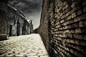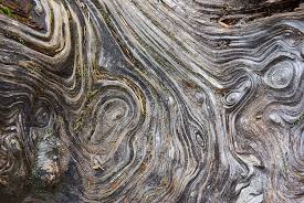
 During the lesson on the 22nd September, I was given the task to take images that portray the element of texture in town. In this lesson I intended to take a photo in which would clearly portray texture but not in a "obvious" way because I have learned through the last few lessons and whilst looking at various numbers of textured images taken by photographers that these images are a good way of gaining attention on your image. During this task I encountered many images which portrayed texture clearly yet when taking a photo, I found it hard to find the best angle to convey it in the best way.
A photo I don't like:
A photo I do like:
I really like this image because I believe it captures texture very well. From the bumps on the berries to the spikes on the leaves in the background and even a few rain drops all give this image the element of texture. Another reason why I like this is because I think that even if this was black and white the effect on the audience would still be the same and they would also understand the texture displayed through out this photo. The focus is another reason why I like this image because the objects at the front are the main focus and behind it's blurred. I believe this to be the best way to show this photo because there are no distractions taking away from the main element.
Progression:
The main part I would do differently if given the chance to re-do this element would be to use my flash on my camera better because I believe especially with photos such as the rain on the bench one, for texture to be clear there needs to be more light and better focusing. Additionally, I would make sure that photos that I take regarding texture would have the type of effect on the viewer that they can almost feel the object. Images that I have found online to do this are as followed:


No comments:
Post a Comment