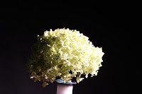

During Thursday 8th October 2015 lesson, I continued exploring ways to take photos of tone within the studio. I really enjoy taking these photos in conditions like this because I like the way the lighting can be controlled onto objects and shown tone. Most of my images which I ended up taking were of people because I found out that these images were the best way to portray the element of tone across the face.
Photos I like:
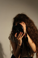
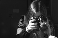
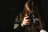 I really like these three photos as they show tone in much more simplistic ways. Even though I only had time to edit one of the images, I believe tone is still shown within. The top right and the bottom right clearly show how the highlight tone is the line on her hair, especially the black and white edited one. Then the shadowed tone is on the right shoulder, which you can see on the original photo. If I were to take the these two photos again, I would make sure the background was plain like the top left photo that was taken on the clear background. I feel like this is better because it puts more empathise on the person and more importantly, the tone conveyed across them.
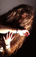
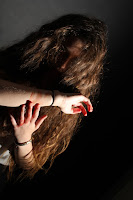 This is also another photo I like. The left photo is the original, whereas the right is edited. Although the reason behind the editing on this one was to show how even coloured photos show tone and its not just black and white photos. I only edited this photo by making it a bit more brighter and then adding a red colour to it because if you look closely to the photo there is red on her hand and arm. The reason for this was because we wanted to make a more "creepier" photo rather than all the other photos which I had already taken. I also feel as the red on the edited makes the emotion of the image much more clearer.
A photo I don't like...
 I like the way tone is shown here, just not within lighting, just with colouring. I like the creepiness of this image however I believe this image doesn't capture tone as best as it could have. I like the concept of trying to get tone through different colours rather than lighting, although the way her hand is set and the angle of the camera, I think takes this away from the element. Another reason I don't like this photo is because the shadow goes right the way across behind the hand, I feel like this is too much of a distraction and think I should have angled it so it would have been the shadow of the hand was shown.
Progression...
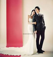
If I was given the chance to re-do this task, I would attempt to more in the way of the one above- so the concept was colour tone rather than lighting- needing to transfer it to black and white. Also, if I could do this in the studio again, I would try to get a different back drop, a coloured one. I believe this could help because the lighting could help the background hold tone as well. The photos below are ones which I have found online and find inspirational to making improvements in my work...


No comments:
Post a Comment