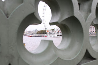
Thursday, 22 October 2015

Studio Reflection in a frame work Diary 22nd October 2015

During the lesson on Thursday 22nd October 2015, our task was to continue to explore different reflection, although not all these images were taken within the studio, it was just a way to explore further reflection but this time, withing a frame.


A photo from the shoot that I like:
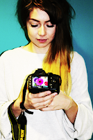
 I really like the way it portrays Framing here. The fact it's simple and the audience can clearly see the actual image which I took- the person, and then the image that was taken of an image- in the camera. A way I could have done this could have been from editing it with a completely different image. 


A photo from the shoot that I don't like:
The reason I don't really like this image is because I don't like the way framing isn't as clear here. Framing would be shown more if I were to zoom out so you could see around the screen. Also, I don;t like how the flash of the other person's camera fills the entire screen as it takes away the reflection.


Progression:

My original intentions for this image was to make it look like part of her body was missing, although as there was lots of other people within the studio and behind us was messy, if the mirror was any higher, either the other people would be in the reflection or the objects behind us would, which clearly isn't what I wanted for this image. Next time if I was able to do this, I would make sure there wasn't many people and behind me- where ever the mirror is angled at- was clear. This would make it possible for the mirror to go higher- maybe on her chest. Another improvement for this image would defiantly be the lighting. Even though the fact only part of her is lit up makes it effective- I believe it would be better if the lighting would be on her face. I could also edit another image within the mirror- that would solve the problem with seeing everything behind. I could take an image of her back, place the mirror with her facing forward then edit the photo so her back is on her front. Examples of ways I could improve this are shown below:


Progression put in place...

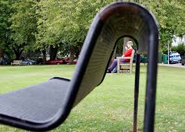
With this progression in mind, when I went to London I kept this in mind and managed to capture this image.

I quite like this image in terms of images in a frame even though it isn't a reflection. I've seen an image like this but it is edited, although this is not.

Studio Reflection in a frame Straight Images


Studio Reflection in a frame contact sheet


Tuesday, 20 October 2015

Reflection Work Diary Tuesday 20th October 2015

During the lesson on Tuesday 20th October 2015, our task was to go into town to capture the element Reflection. Everyone knows reflection comes from mirrors. Yet today I managed to find out many more objects which give off reflection- to my surprise!

A Photo I Like:
I really like this image because even before I edited this photo, the actual camera I took this off turned white for some reason, yet the screen with my camera in stayed dominant. Another reason I like this photo is because I like how the entire photo is just purely of a reflection- nothing else (other than a bright camera frame).


A Photo I don't Like
Much like the photo directly above this, I wanted to use the camera screen to show reflection of a building. However the focus didn't work this time. I would defiantly improve this if given the chance to redo. A way I would do this is by making sure the screen shows a clear building and before taking it, make sure the focus is on the screen not the actual camera. I believe the fact the focus was totally out on the screen makes this an image that I don't like.

Progression:

If given the chance to,I would like to re-do and improve because I really like images showing a reflection within an eye. I could do this through editing a faded image inside the eye, yet bold enough to see what it is. I would also improve this shoot by taking more reflection photos of different objects because as you can see, being in town only gave us a limited number of things to reflect and the majority are of us. Examples of ways of editing image such as this one are shown below:


Progression put in place...


With this progression in mind, when finding images for another topic, I was able to position my subjects and get these images. I quite like this because you can see both the subject and the reflection in the dirty water, alongside seeing the statue in the puddle.


This is my example of an image shown above in my progression section. I edited this just by fading an image of a daisy onto an image of an eye. I really like the out come of this- even if it is just edited.

Reflection Straight Images


This is the image unedited. For some reason the along the sides went very bright. This was a photo of a camera screen. I really like the way this happened accidentally and you can still see the reflection of my camera from the screen. Another reason for why I like this is because it's really simple yet it shows reflection very well.


 This is another photo which I have chosen for my Straight images because the reflection shows more than the actual objects. Also, because the reflection is more faded, it's as if the leg isn't even there (which it isn't). The burliness of the reflection makes this a better photo because it clearly shows to the audience how reflection can change the perspective of the object with out it being directly manipulated.


 The fact that this is a simple sign may suggest to some that this is a boring photo with no relevance. However, if you focus more on the image, you can see how reflection is shown on the water. A reason why I like this photo is because if the actual object was hidden the reflection on the water might be harder to understand that it is a sign. Most of the sign is missing which supports my view of how the reflection can change perspectives of an object, much like we tend to do when we first glace at a photo- we miss-interpret things wrong at times.


 This is a simple way of showing reflection, however the reflection
on this photo is just of lighting as you are unable to actually make out any objects. The main reason why I like this photo is because the focus on the nails makes reflection very clear- blurring out the back ground. Also, the way the reflections are just in lines going down the nail shows the viewer where the lighting is.


This is a final image that I really like on showing reflection because I like the way that the image is copied almost half and half. One half is the "Real-life" and the other half is the reflected. I really like the way the reflection is much darker and blurrier than the other. The fact you can focus on the stones on one side and not the other- the same with the feet, shows a clear division. I also like how this image could be a before and after editing photo due to the element of reflection.

Reflection Contact Sheet


Reflection image bank.

 This is a photo that I find really inspiring because I like the way the different reflections in the image portray different angles of the person who is being photographed. The fact that they are far in the back ground yet are still vision even from the first glance makes this a really interesting photo. I would like to react a photo in this form because I like the depth the reflections bring to this image. 
 This is another image which I like not just because of the reflection but because of the editing that has been used. The way that its just the main focus in the reflection is coloured draws the eye to that object yet the eye then wonders and sees other parts to this image. This is a clear example of how reflection can distort object which I really like and hopefully get to recreate when I go out to take my photos.
 I also chose this image because I personally find it very intriguing and would love to recreate an image like this- if I were to have a mirror like this. The way that you see her body from two angles makes this a really interesting photo which to me is very inspiring. I also like the way that everything is black and white, so nothing draws attention away from the main focus of the image- the girl holding the mirror.
 The fact that the water in the glass flips the reflection of what is behind this makes this an inspiring image as well because even though we can only see (what looks like a tree) in the back ground, if you focus on the glass reflection you get to see more into the surrounding. To me this is a reason why I like it as I would like to recreate an image including reflection the way this does.
This is a final image that I wanted to include in my image bank because I find it really inspiring as the reflection, even from something as simple as an eye, you can see something in the outer surroundings.

Reflection definition.

My definition of reflection: To me reflection is looking into something and seeing a repeated pattern in a way that could change the original shape, for example looking into a lake could produce a more wavier version of a tree than when you look at a normal standing tree.

Reflection definition: The throwing back by a body or surface of light, heat or sound without absorbing it.
For example this image on the left shows how a simple reflection can give a different perception of the object in front of the mirror/ object that gives the reflection.


The image on the right is an example of reflection in photography. The way the shallow puddled creates a copy of the umbrella and the person standing on the puddle.


Framing: the action of framing something within an image. For example having a photo of someone holding an image with a frame around it.

Vivian Maier Research

I really like this image and find it very intriguing. To me I consider this as art however many others may tend to disagree. The way you can see her faintly in the reflection of the window of what looks like someones home, and then theres also her in the mirror in the house. To me, this should be considered as art because the photo really captures reflection as an element in a really creative way. Focus must be applied to this image before understanding what the image is, to me this is what makes art, art.

Vivian Maier may have added herself into her images because it's her way of putting herself into history, leaving a trademark of herself. She was a nanny to children although didn't treat these children very well. Perhaps this is why she took photos of her reflection, instead of herself. If they were of herself they could be consider direct images, although because refection is faded it harder to work out who she is, as if her reflection acts as her disguise as she feeling guilty. Alongside this, growing up Vivian Maier found a selection of storage locker filled with photos, newspapers and even home films. She may also have added herself into the reflection instead of the image because it's as if she isn't allowed into the building, she's looking within, maybe to symbolise her loneliness.

Vivian was born in New york City and was an American street photographer on February1st 1926- April 21st 2009. she spent most of her youth in france which maybe stemmed her liking for taking images on the streets as France is meant to be known as a place for beautiful imagery. AS a child, Vivian's father wasn't with them anymore- as if an incomplete picture because he had left the frame. Perhaps this is why she put herself in the reflections of her images because as she discovered with her father, when he left, he was no longer able to be seen, maybe Vivian's ambitions were to make sure that even when she leaves, she will always be in the frame for those who want to find her.

Shape studio work diary Thursday 15th October 2015


During the lesson of Thursday 15th October 2015 we continued our work from Shape yet were able to experiment within the Studio. I really enjoy working in the Studio because I feel that being able to control the lighting in such an important factor of taking photos creating a certain element. I really enjoyed this lesson on taking photos of shape because I got to explore different ways to do this. By either controlling light to make shadows different, or to control the angle to make the object itself a different shape. With-in the lesson I also got to explore ways to change the manual setting on the camera to set it up with the lights of the studio.


A photo I don't like...
Even though I like looking at this image, I don't like it on terms of showing shape because I believe there isn't enough shape conveyed in this photo. I also don't like this photo because of the angle. I believe it would have worked better if I aimed the camera lower- just above the level of the pocket watch. To me this would work better because you would be able to see the shapes shown in the pocket watch lid as well as the actual circular shape.


A photo I do like...


I really like these images because I believe the shape portrayed is exactly the way I wanted. The circular shape of the ring and the heart shape of the shadow. The reason I like this simple portray of shape is because there aren't anything else distracting the eye, it's just literally these two shapes. I also like how this photo came out exactly how I wanted- I aimed to recreate an image shown on my image bank and feel like this done so.

Progression...
If given the chance to re-do this task I would use different shapes in the lighting- or looks of different shapes covering the light so shadows would go across the table/surface. I would also make sure the shape that I wish to show through my image is the main shape. Being in the studio, I would make sure I would also use people to show shape as well because I believe this would be a good way in showing that one type of shape can then create a different shape. Photos below are images I have found online and would like to keep in mind if I was able to re-do this task...