Wednesday, 10 February 2016

Connecting essay 2

This is an iconic image of Marilyn Monroe looking into a mirror. I chose this image because I think it is a great example of reflection because you can see her face in her reflection but not in her actual body. The way this image is in black and white helps portray a beautiful and feminine mood to this image as her skin looks so pure and fresh.  

This is an image I took of a subject looking into the mirror. I positioned her so the light is brighter as I believe this helps the femininity portray through it. Also the use of the element of reflection is a key aspect of it because you can see both the back of her head and the front of the same photo- with out having to be edited. I also like the seriousness of the image as my subject appears to be staring at herself intensely- yet you are still able to read into it.
These images connect because both of the subjects are looking into a mirror. They both also look very feminine and beauty related. I like how the element of reflection are portrayed to show both the backs of their heads and their faces.

Tuesday, 2 February 2016

Connecting essay 1

I decided to choose this image from the internet because I believe it is really eye drawing and intriguing as it conveys many different elements. These consist on tone colour and shape. The tone is shown through the different shades within the eye. The colour are shown through the strips of the eye and also the eye shadow which is on the eye lid. Also there is muted colour of red through the veins across the eye ball. The shape of the eye is the most drawing part because it is very wide- as if the subject is shocked. As this is the main concept of the image it is almost as if the photographer has positioned it so the black pupil is in the center- as if this person is looking at the viewer.

The photograph which I shot and chose is one I shot for progression of colour. I used this because it shows the pure colour within the eye, along side the muted colour of the veins- much like the one above. This image also shows colour due to the leading lines of the eyelashes, pointing down towards the pupil- the main object in this image purely due to the darkness of it. Also the dark colour of the leading line of the eyebrow is important as it shapes the eye. I also like how my subjects eyes aren't wide open so much it looks like they are straining, they look calm and causal.
These two images connect due to the drawing of attention created from these images. The audience are forced to look into their eye. Looking into the pupil, the colour is then exposed to us. Even though the image online is edited with a high structure, they are both connect because tone can be shown from both.

London trip report


Thursday, 21 January 2016

Print conventions

The ratio comes up hen you are on the crop tool in the top left hand corner.

When printing we need it at 300 DPI
1)

 2)
 3)


Tuesday, 19 January 2016

4th plinth work diary 19th January 2016

During the lesson on Tuesday 19th January 2016 I captured images of an object within the studio and then edited them onto photos I shot at the weekend. I wanted to do an image out of the box and I thought, "If someone was to see something in the street what would be the strangest and oddest thing for them to see?" This is why I chose my object to be a dinosaur. Although when I came to editing, I wanted to make is a realistic as a dinosaur in London can be. I came across this by making sure the tone and colour of the object fitted in with the surrounding image. This meant changing the curves and saturation of the object layer.

A photo from today that I like…
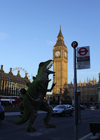
I only managed to create 2 photos, This is my favourite one that I have. The reason I like this is because I feel that it looks as if it's really there. I spent much more time on this one than the other one so maybe thats why I prefer it. Alongside changing the curves around making it a bit darker and changing the saturation. I used the brush tool and painted over the darker bits- alongside burning the shadow parts.


A photo from today that I don't like...
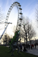
This is the other image I create during todays lesson, although I do not like this one as much as I do with the one above, this is partly due to the fact I put a green object on a patch of green grass. Also, the colouring doesn't fit in, it stands out to much- almost as if a green screen. I also don't like how crowed this image is, the dinosaur is covering over people and it's just to cramped and too much to look at.


Progression…


To improve on my work, I would like to experiment with more objects to place within my images. Examples of objects I could use are shown here...

4th plinth straight images


To create my 4th plinth image I placed my chosen object- a dinosaur- on to a photo I took at the weekend at London. As I shot the dinosaur in the studio, it was quite bright, but where I wanted it in the photo, everywhere was shadowed so it didn't look right. So to solve this I put masks on my layer such as curves and changing the saturation. This made the dinosaur much dark and more "in place". When I selected the object it originally had a line from the background all the way around it, to result this problem I used a feather to ease away this line. 

Research photographers 4th plinth Cedric Delsaux

Cedric Delsaux was born in 1974 and for 10 years he traveled the boarder increasingly fine line between fiction and reality. We can see this from his work. Especially the shown in this post of a building and darth-vader editing in. May of the photos I came across consisted on a supernatural editing. Many showing a theme of star wars. Even with cloone troopers or darth-vader. Delsaux work is very intresting and intriguing- these photos were taken in Paris, an almost capture events of star wars in real life, revealing how our perception of the city goes through the filter of fiction. This series was called "The dark lens"- wuite catchy i suppose seeing as it's "The dark lord"... It almost blurs reality with fiction- what's real and what's not? I've came across a variety of his work, even though I am not a fan of star wars or supernatural things, for some reason his work appeals to me. Especially the foggy one with a shadow. I like this one because it could simply be a building or a group of trees, although it's connotation due to the angle could be a monster towering over these roads. Or the question of is this object actually there? Or was it just edited?
I like this image of his work because at first glimpse it looks like a simple forest road on a snowy day. Although looking closer you can see an object which is out of place and shouldn't normally be there.