Thursday, 15 October 2015

Shape studio Straight Images

My original aim when going into the studio today was to take images such as this one. I got inspiration from this on a photo shown in my image bank. I really like the way the circle is manipulated into a heart shape due to the lighting. I also like the way this photo is very simple and shows only 2 shapes so the focus isn't lost by an over whelming amount of shapes. The circle and the heart are very clear on showing what they are. Not just this but another reason why I like this image is because originally, my background was going to be clear (the table) although I felt that this was going to wash out the entire image. So I was able to borrow someones scarf to give the image more colour.
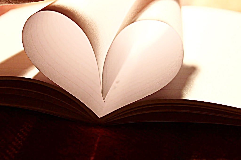
This is another image that I got inspiration from a photo on my image bank. Although unlike the other image, the pages wasn't all the way down to the spine of the book, someone held them in place of this shape. I really like this image as there is a clear focus of shape on the heart that fills the majority of the shot. Although the negative of this image was the shadowing shown from the person's hand who was holding it, unfortunately, I wasn't able to angle it so this wouldn't happen.


Again the simplicity of these shapes are the reason I like this image. I like the way that if the actual object way covered everyone would be able to know, the vase is a vase/ really big win glass. I also like how there are coloured shapes on the glass as well. This image shows both negative space creating a longer and more stretched out shape and the normal shape of the glass.


This also another image that I like because there a lots and lots of shaped circular hundreds and thousands. As they are really small, the shape is only clear when more focus is applied to this image. Also I really like the way the star cutter is the the left hand side because I feel that this way it shows how I didn't want all the focus to be on the star as I wanted it to be only all of the photo.


Finally, this is another image which I liked from the lesson today in the studio because the simplicity of shape of the heart covers the full photo and I really like how it leads to the lipstick. Furthermore I also like the shape of the lipstick its self because everyone knows the stereotypical shape for a lipstick so I feel this image relates to it very nicely.


Shape Studio Contact sheet


Wednesday, 14 October 2015

Shape in town work diary Tuesday 13th October 2015

During the lesson of Tuesday the 13th October 2015, our task was much like the prior lessons that we have had, although this time our task was to capture image showing the element of shape.

We can see shapes in many ways in our everyday life, whether is simple and clear shapes (like the image on the left), or just subtle hints given to us through nature (like the image on the right). Shapes make up everything. Everything has an outline, everything is a shape. Given the task of shape seemed rather great! Yet this task was surprisingly challenging. I believe for shape to be shown in it's best way, light needs to be a very key element, much like all the other elements I have done so far.
I actually found capturing shapes rather hard because I wasn't able to find that many photos, although I did learn how you can change the shapes of something depending on the angle you take the photos. Through the two lessons on shape, I learnt techniques with my camera this included the angles making shadowing and then also I learnt the importance on editing to make a shape more dominate. I also learnt in this lesson that a photo doesn't need to be overly complicated, even the simplest photo of shape can be interpreted as art. 

A photo I don't like...
Even though this image shows shape in a subtle way, I don't like this photo. I believe this building is a good way of showing geometrical shape however I believe it's too off in the corner- it would look better if you could see more of the image. I also do not like how far away this image is taken from the building- it would be better if it was bigger yet not all of the screen.


Progression...
If I was given the chance to re-do this, I feel like this photo shows an example of what I need to improve. The leaves cover the main ends of the shoes- to improve the shoes need to be more clear. I would do this with all my own images as well, I would make sure the shape I'm trying to show would be the most dominate in the image. This could be by making the shape the darkest/lightest or the biggest focus point. Photos below show my inspiration in changing my work if given the chance to...


A photo I do like...
This is a photo that I took on this shoot that I do really like because I believe at first glimpse, the main shape would be the foot shape, yet looking further you can see many of shapes within the shoe itself- whether is squares or rectangles. Another reason I like this is because the main focus is the shapes and nothing takes off the focus of this.

Shape Straight Images.


 I really like this image to display the element of shape because it is clear how the eye and focus is drawn all the way around the stair case until it and. Not only is the focus followed, there is a rectangle shape repeated through out. There's big rectangles in the middle of the image, yet there are small rectangles from the stairs which follow through the entire image. I really like the geometric use of shapes in this image.


 This is another image that I have chosen for my Straight Images because even though this is normally a cubed room, from the outside and at this angle it looks a sort of pyramid shape. I also like how I managed to show the sky with the clouds in this photo as it creates the wall the stand out even more. Another reason for my liking for this image is because if I were to turn this black and white, it wouldn't make any difference to the shape of the wall. Also it may even bring out shapes that the audience didn't notice. 
As you can see, this image is inspired from the image on my image bank blog post. However, if possible, I would like to redo this photo in the studio as I feel it would be better if the background was clear. Despite this, I chose this for my top 5 photos because I really like the simplicity of the heart shape on the pages of the book. Another reason I like this is because the eyes follow down the hearts tunnel leading them to the end, if I were to redo it, I would put something at the end.


I also really like this image because it shows the clear triangular shape on the roof of this shelter. There's also the rectangle running along the right hand side of this image. I really like the simplicity of these geometric shapes as we all can clearly tell what shapes are being portrayed within. Just like an image above, I like the way that the sky is the majority of the image here and the shapes are at the bottom. Also I really like the irregular shapes in the clouds.   


Finally, I chose this image for this blog post because I really like the shapes shown within the shoe print. Not just this but the actual distinct shape of the feet. Everyone know the shape of the bottom of feet and this shows that, although this well know outline is also classed as an irregular shape, which is why I like this image because to most, this is just a picture of the bottom of shoes, yet it also shows shape. Another reason why I like this photo is because only the shoes are in focus. 

Shape Contact Sheet


Tuesday, 13 October 2015

Shape image bank

 I really like the shape displayed in this image. The reason for this is that at first glimpse of this image you'd see 2 simple circles for the rings. Then when looking closer you can see a heart that has shadowed across the book. I really like the display of shapes in this photo and how the background doesn't take away much of the focus. This photo is inspiring because I really would like to convey shape in this way.

This is another image that I really like because the shape of the stereotypical heart is being displayed by a book. I also like the way at the end of the heart, there's an object that looks like a flower. The way the eyes follow through this sort of heart tunnel, to see the flower. Another way in which I like this photo is because the background around the book is plain and out of focus, the reason I think this makes in better is because it doesn't distort the focus on the heart.
 This is another photo which I really like because the negative space is the shape it's self upon the sunset sky. The main focus of this image is the heart its self as nothing takes off the focus of this shape.


Furthermore, this is another photo which I really like because even though it's clear this is a frog, you can only see the bottom of it. The perspective on this image is really good that makes this a realign interesting picture. I also really like the use of negative space of the green on the green background of the leaf.


I also decided to choose this image for my image bank on shape because its simplicity of showing the shapes makes this intriguing. Negative space is strongly used in this instance. The eyes are the main shape in this image. Simple circles yet they sort of draw in the attention and makes you focus on them, as if they are looking into you. I also like the way the negative space shapes the cats faces into an irregular shape.

Shape Definition.

Shape is an area enclosed by a line. It could be just an outline or it could be shaded inside. These shapes can be either geometric such as a circle or a square, or the shape could be irregular such as people or pineapples.  for example this image on the left is a simple shape image.

My own definition on a shape is something that has a clear line around it and it doesn't matter whether it's in colour or not, the shape would still be able to be seen.
The image shown on the right however isn't just the simple shapes, it has other objects creating this shape, a circle creating a more interesting image to look at compared to just normal everyday shapes.